Digital Marketing, Web Designing, Web Marketing

14 Essential Tips for Improving Your Web Design

Within 5 seconds of landing on your website, can your visitors determine what your company does? Could users easily navigate to the blog if they need to? Is the layout of your pricing easy to understand?  Do you have an extremely high bounce rate?

If you’re finding yourself answering ‘no’ to these questions, it might be time to take a hard look at the way you’ve been designing and optimizing your website.

A website can’t simply succeed by excelling in limited aspects (such as solely design or content). It needs to have a design that feeds into your website’s user experience, functionality, and appropriately complements your content.

Your website also needs to clearly communicate with your audience what you do, why you do it, and who you do it for. It’s easy to get caught up with how great you are as a business, that you forget to make sure we are addressing core concerns your audience has first and foremost.

So, what do you need to know to start improving your web design?

To answer that, here are 14 website tips to ensure that you’re going in the right direction in your redesign and are assuring you aren’t turning visitors away.

14 Tips for Improving Your Web Design

1. Have a Plan

Don’t just start designing your website. To ensure that your website is effectively meeting the needs of your visitors you need to map out your buyer’s journey from the first time they visit your website to the moment they become a customer.

What pages are they going to view, what content are they going to read, and what offers are they going to convert on? Understanding this will help you design a site that helps nurture leads through the sales funnel.

You want to design your website for the next step, not the final step. It’s all about answering the right questions in the right order. This might be where context comes into play. Take what you already know about your current customers (or even interview them) and research how they went from a visitor to a customer. Then, use this data to map out your strategy.

2. Remove the Following From Your Website

Certain elements on your website are going to detract from the value and message you’re trying to convey. Complicated animations, content that’s too long, stocky website images are just a few factors on the list.

With an audience that only has an attention span of 8 seconds, you need to create a first impression that easily gets the main points across. This should be done with short, powerful sections of content and applicable photographs/icons that are sectioned off by clear and concise headers.

If you’ve got those right, then review it and make sure it doesn’t contain jargon or ambiguous terminology. It only serves to muddy your content and confuse your users.

Some words to avoid include next generation, flexible, robust, scalable, easy to use, cutting edge, groundbreaking, best-of-breed, mission critical, innovative … those are all words that have over used by hundreds if not thousands of companies and don’t make your content any more appealing.

3. Include Social Share and Follow Buttons

Producing great content and offers only go so far if you aren’t giving your users the opportunity to share what you have.

If your website currently lacks social share buttons, you could be missing out on a lot of social media traffic that’s generated from people already reading your blog!

If this sounds new to you, social sharing buttons are the small buttons that are around the top or bottom of blog posts. They contain icons of different social media website and allow you to share the page directly on the social media channel of your choice.

These buttons act as a non-pushy tool that encourages social sharing from your buyer personas.

If you are looking for some tools to get you on the ground, check out the two free, social sharing tools SumoMe and Shareaholic.

4. Implement Calls-to-Action

Once your visitors land on your site, do they know what to do next? They won’t know what pages to view or actions to take if you don’t provide them with some sort of direction.

Call-to-action buttons are one of the many elements that indicate the next step user should take on a page. While many of us know that, it can be easy to fail to accurately use them to guide users through your website.

It’s easy to spam your website with the most bottom-of-the-funnel (BOFU) call-to-action, without even properly nurturing your users with other calls-to-action that are more top/middle of the funnel.

To recognize whether or not you’re guilty of this, start reading through the pages across your website. Are you finding most pages, even blog articles, with only a call-to-action for a demo/trial/consultation? Then, it’s time to update.

Take the time to add in call-to-actions that give them materials to educate themselves and help solve their pain points. Once they identify your company as one that provides materials that are relieving these, they will feel more comfortable researching your services to see if you can personally make these solutions a reality.

Some example call-to-actions are to click here for more information, download our sample GamePlan, sign up for a webinar, watch the video, see all inbound marketing services, and see pricing. For more information, check out this offer to get you using call-to-actions the right way to generate even more leads.

5. Use the Right Images

Not every image is going to fit with the type of message you’re trying to show your audience.

Fortunately, you have a lot to choose from (even some that are for free). But still, cause caught many of us decide to plague our website with extremely stocky photos.

Just because a stock website has the image, doesn’t mean it looks genuine and will evoke trust in your company. Ideally, you want to use photos that portray images of the real people that work at your company and the office itself.

If real photographs aren’t an option, there are techniques you can useto help pick out the right type of stock photo. This will aid in bringing more realism to your brand and making sure the images match who you are and what your content is explaining.

6. Navigation

When designing your website, navigation is key, it’s essentially the map that displays the core places users can visit.

There’s nothing worse than a site with a disorganized or confusing navigation interface. When improving your website’s navigation, it’s important to ensure that your visitors can easily find what they’re looking for.

Some characteristics of a lean navbar include streamlined content, navigation hierarchy, and responsive design, so the experience doesn’t drastically change on mobile.

If users cannot find what they’re looking for, they have no reason to stay on your site. Instead, they will certainly bounce and find a competitor that offers a better user experience.

7. Let Your Visitors Scroll on Your Homepage

Above the fold is old. Don’t be wary of designing a slightly longer homepage. Including 3-5 sections that help direct new and recurring users to proper areas of your site can help create a seamless experience.

But what should these sections be?

This list could go on forever, but a quick hit-list of some of the more crucial elements includes:

  • Value proposition
  • Intro Video
  • Overview of Services
  • Product Features
  • About Us
  • Testimonials
  • Case Studies/ Success Stories
  • Resources

If you want a more expansive list, check out this awesome infographic or one of Ramona Sukhraj’s blog articles revealing other important homepage elements not mentioned here.

8. Don’t be Afraid of White Space

Whitespace is an essential design element that helps you break up the page and increase readability.

Also called ‘negative space’, white space refers to the areas around elements on a page that are empty and lacking content or visual items.

Although extra space may seem superfluous, it’s actually responsible for readability and content prioritization. It also plays an important role in the design process and positioning website design elements.

If you know of some pages lacking white space, review the page and strip elements or content that aren’t necessary to the purpose of the page. Then, make sure this content is properly grouped so users are able to distinguish where they belong on the page. If you need some example of the website doing this well, check out these all-stars to help aid you on your improvements.

9. Mobile Optimization

Don’t forget about optimizing your site for mobile. If you don’t already know, 80% of internet users own a smartphone, and “Google says 61% of users are unlikely to return to a mobile site they had trouble accessing and 40% visit a competitor’s site instead”.

I’d be a little concerned if I were you.

It’s a necessity to tailor your site to fit the needs and wants of your visitors. You might want to ask yourself, why would someone access my site on mobile? What things would they look for? Does my experience currently allow them to do those things easily?

If your websites lagging on its mobile optimization, check out some of these awesome mobile websites to understand how they have created seamless mobile experiences for their users.
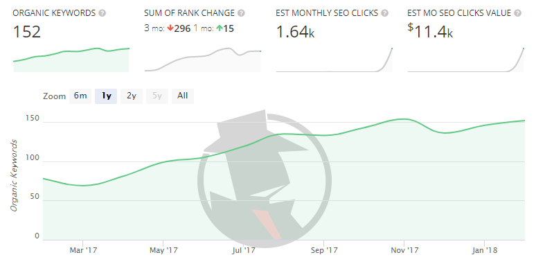
10. Get Found

If you want to develop a substantial online presence, then you need to create a website that can get found.

This starts with developing an SEO strategy that takes into consideration the search terms your buyer personas and audience would search for. This strategy terms should include creating content that’s relevant to the needs of your visitors. Videos, blog articles, and e-books are a few examples of content that can do this.

Make sure you don’t get too sidetracked with the endless content possibilities you could rank for. Identify the proper keywords first that your audience is actually searching for so you aren’t attracting too many visitors who’d never convert to your product, let alone your offers.

11. Never Stop Testing

Evaluating conversion paths, how far users scroll, and where they are clicking, etc, are important qualities that can reveal if your pages are performing the way you intended.

If you’re someone that has tons of pages to go through, chances are you may find this issue on a lot of pages, especially older landing pages. Pages like these may actually be performing quite well, but contain outdated information that you know could be updated. Others may just need some tweaking updates or design changes.Simple changes such as button colors, headers, or adding a few sentences in your copy could make incredible differences in the page’s performance.

But rather than changing them and set them on their way, especially if you don’t know what to change, you can use tools to create A/B tests for them, multi-variant tests, or even set up heat maps to see what users are doing. Each test can reveal more a variety of data that identifies why users are interacting with pages in particular ways.

12. Identify Unknown 404’s or Broken Links

Depending on the size of your website, or how long it’s been around, you may actually have a few pages or links here and there that aren’t working. And on top of all that, your visitors won’t even let you know.

Take the time to evaluate whether or not your site has broken pages. You may be surprised to find previously high performing landing pages that are unpublished or website pages that are improperly linked.

13. Create New or Unique Offerings

Converting visitors is the core way you can evaluate how many users are moving down your marketing funnel. Many of us know that the way you typically convert visitors is by presenting offers, demos, or items that they will find attractive.

But with so many resources out on the internet, it’s now more difficult than ever to break through the noise and get people converting on yours.

This means it’s more important than ever to not only pay attention to what offers and resources are out there within your service area, but what isn’t too.

Maybe you’re a social media company who notices many other competitors are making eBooks on how to create a social media calendar. Rather than creating a similar offer, could you take it a step further and create a tool that allows people to enter in some information that helps generate a schedule that syncs to their Google calendar?

If this seems too complicated, you could also try identifying templates that aren’t currently widely available and quickly creating one and promoting it.

Whatever your decision, it’s important to make sure what you are doing is a step above your competitors. Copying content offers that are currently out there will only keep you lost at sea.

14. Update Your Content To Appeal to Your Persona

When you’re a company writing copy that you want to want to impress your website visitors with, many of us tend to fall into a dangerous trap.

The content is ‘we’ and ‘our’ focused.

‘We will increase revenue by..”, “Our benefits include…” are just examples of the headers that many uses throughout web pages. Although you may be showcasing the ways your business might help because of how great you and your products are, it’s not going to get the point across.

Strip out the “we’s” and “our’s” and replace them with “you’s” and “your’s”. Your potential customers want you to meet them eye-to-eye, understand the pain points they have, and directly explain how they could be solved.

So rather than a header like ‘Our Case Studies’, try something like ‘Your Potential Success Story’. Or rather than a careers page that focuses how great the company is, filter in some content that explains how applicants futures are important and their ability to define their future working at your business.

This grammatical switch may seem insignificant, but subconsciously it will affect the way customers see your business.

Digital Marketing, Web Designing, Web Marketing

8 proven ways to lower your bounce rate

Many businesses spend a considerable amount of money driving visitors to their website but don’t always do a great job in keeping them there.
After all, what’s the point of driving traffic if visitors leave after a few seconds without making a transaction? This is exactly what happens if you have a high bounce rate.

The ’bounce rate’ refers to the percentage of visitors to your site who leave after viewing only a single page.  Depending on the nature of the website it’s not uncommon for websites to see bounce rates higher than 60% or even 70%.

123

If you have a high percentage of bad bounces (those who leave a page that you would expect them to use as a doorway further into the site) rather than bounces from a page such as a contact form where you don’t expect additional browsing, it’s time to dig into what is causing your high bounce rate and work out how to fix it.

You’re not going to turn visitors into customers if they are exiting your website almost as soon as they land on it.  So here are eight proven methods to help lower your website’s bounce rate:

1. Keyword rankings

Are you appearing in Google or Bing for irrelevant search results?  Are your pages that do rank, outdated?

Google Search Console provides a list of the keywords that you are ranking for in its search engine, which is most likely to be your biggest provider of organic search traffic.  Look through your top performing keywords, check your result in Google and ask yourself if the content on that page is as good and as fresh as it needs to be to keep your visitors on your site.

Do the landing pages of these keywords match up with the high bounce rate that Google Analytics is reporting?  If so, it’s a good bet that the content on those landing pages for those keywords needs improving to better meet audience expectations.

2. Improve page load speed

Google has been a fan of quick websites for years.  This dates as far back as 2010 when the search engine stated “we’re obsessed with speed” and went on to list some useful tools to help webmasters improve their site’s loading times.

These days Google provides PageSpeed Tools because a quick loading website is more important than ever. The search engine has confirmed it’s also a ranking factor and there is a direct correlation between page load speed and higher bounce rates. Unless you’re as popular as the BBC or the NFL, your business isn’t going to fare too well in Google with a slow site.  The aforementioned tool set from Google is a good starting point if you need some help improving your page load speed.

Page load speed is part of the Google algorithm but it’s just as important to website visitors. Put yourself in your prospective customer’s shoes; imagine entering your website for the first time and having to wait 5+ seconds for it to load up.  What’s the first thing you’d do?  That’s right, click the back button and try out a competitor.

Check your Analytics data for your page load times as well as the Google Tools suggested above to improve your website’s loading time.

3. Weak opening paragraph

If you want to keep visitors on your website then you’d better have good content.  In fact, you’d better have a great opening couple of sentences.  These can often determine whether the user is going to continue reading or click back in their browser and find an alternative resource.

On pages that are full of content, but have both a high bounce rate and low session duration, it’s always worth asking a friend or colleague for their opinion on your text in the hope they can help you spot any issues.

Poorly written content is a big reason why users don’t stick around. Content that is not written for the web is also off-putting and can cause your visitors to bounce back to the search results. Make it easy for a visitor to digest your content if you want to keep them around.  Split your content up with headers, use images as shown in the example below and summarise key information in bullet points to make the text easy to scan. This is especially important for visitors loading up your page from a mobile device.

This image shows how to properly lay out your web content for easy digestion. It uses a clear header, short sentences and bullet points:

4. You’ve given the user what they want

A high bounce rate is not necessarily a bad thing. The page may have given the user what they needed quickly. It could be that your visitor got the answer they were looking for when they landed on your page and that you have no call to action or incentive for them to stay on your website any longer. A contact form, a subscribe page or a thank you page may all have a high bounce rate without there being any cause for alarm. If you have investigated the cause of the bounce and have determined that the page is likely to have satisfied the user’s needs without them having to go elsewhere on site, you can be happy you have given the user what they wanted.

If this particular page is trying to sell your product or services though, or is a main doorway page such as your homepage, then it’s unlikely you’ve given the user what they want from that page alone. Think about A/B testing your call to action: perhaps you simply have insufficient content on your website to help users navigate your site or, perhaps your keyword strategy needs some work.

5. Improve mobile-friendly/responsiveness

An increase in mobile traffic has been the trend for the past number of years, to the point that Google confirmed last year that more people search on mobile devices than desktops.

Google is in the process of creating a mobile first index and with so many search users browsing the web from a mobile device, it’s absolutely essential that your pages are mobile friendly.  From basic things such as checking the responsiveness of your design, to implementing more advanced techniques such as Accelerated Mobile Pages (AMP), presenting an accessible, readable and easily navigable page for mobile users is another way to cut a high bounce rate.

Here’s a quick checklist you can bookmark to see if your website is mobile-friendly or not.

6. Annoying interstitials

The one secret of how to annoy users when they land on your website for the first time is to pop up an annoying interstitial in their face.  Google has a mobile interstitial penalty live which may cause sites that use intrusive mobile interstitials to lose search position. In addition to the loss of rankings, interstitials prevent the user from seeing the content they clicked through to access, meaning they are likely to leave and take their request for information elsewhere.

7. Content below the fold

Having previously mentioned the importance of your opening paragraph, keeping content above the fold so the user sees it immediately as they land on your page is just as important.  This is particularly true when it comes to mobile devices which have smaller screens than desktops and therefore less room to squeeze in the content.

Your users don’t like seeing your banner, perhaps a drop down menu and an ad when they land on your page, leaving them to scroll down to click on the content they were hoping to read.  Make sure to get as much content above the fold as you can in order to hook your reader as soon as they land on your website.

8. Misleading meta titles and descriptions

Google’s results are getting better and better over time, but it’s still possible to rank for irrelevant keywords, whether intentionally or not.  However, if you’ve written misleading titles and meta descriptions to get the user to click through, you’ll find that you have a high bounce rate as they discover they have been duped and head back to Google to find a page that genuinely offers them what they’re looking for.

If visitors are entering your website thinking your content is about a certain topic, only to find that it isn’t, you’re going to leave a bad impression with that user.  Neither of these are a good thing in your attempts to increase rankings, traffic and ultimately, sales.

Hopefully after a few tweaks to your website and webpages, these tips will help lower your bounce rate and ultimately lead to an increase in the number of enquiries or conversions your site logs.


Digital Marketing, Web Designing, Web Marketing

10 Ways to Speed Up Your Website – and Improve Conversion by 7%

Think the speed of your website doesn’t matter?

Think again.

A 1-second delay in page load time yields:

  • 11% fewer page views
  • 16% decrease in customer satisfaction
  • 7% loss in conversions (source: Aberdeen Group)

Amazon found this to be true, reporting increased revenue of 1% for every 100 milliseconds improvement to their site speed. (source: Amazon)

So did Walmart, who found a 2% increase in conversions for every 1 second of improvement.

10 things you can do to speed up your site

1. Minimize HTTP Requests

According to Yahoo, 80% of a Web page’s load time is spent downloading the different pieces-parts of the page: images, stylesheets, scripts, Flash, etc. An HTTP request is made for each one of these elements, so the more on-page components, the longer it takes for the page to render.

That being the case, the quickest way to improve site speed is to simplify your design.

  • Streamline the number of elements on your page.
  • Use CSS instead of images whenever possible.
  • Combine multiple style sheets into one.
  • Reduce scripts and put them at the bottom of the page.

Always remember, when it comes to your website, leaner is better.

Pro Tip: Start a campaign to reduce the number of components on each page. By doing this, you reduce the number of HTTP requests needed to make the page render—and you’ll significantly improve site performance.

wordpress-optimization-tips

2. Reduce server response time

Your target is a server response time of less than 200ms (milliseconds). And if you follow the tips in this article, you’re well on your way to achieving this.

Google recommends using a web application monitoring solution and checking for bottlenecks in performance.

Pro Tip: Read this report by Singlehop, Critical Ecommerce Infrastructure Needs, to learn nine things you need to focus on to keep your site performing well.

Then tap into these resources:

  • Yslow – to evaluate your site’s speed and get tips on how to improve performance.
  • Google’s PageSpeed Tools – to learn more about performance best-practice and automate the process.

3. Enable compression

Large pages (which is what you could have if you’re creating high-quality content) are often 100kb and more. As a result, they’re bulky and slow to download. The best way to speed their load time is to zip them—a technique called compression.

Compression reduces the bandwidth of your pages, thereby reducing HTTP response. You do this with a tool called Gzip.

Most web servers can compress files in Gzip format before sending them for download, either by calling a third-party module or using built-in routines. According to Yahoo, this can reduce download time by about 70%.

And since 90% of today’s Internet traffic travels through browsers that support Gzip, it’s a great option for speeding up your site.

Pro Tip: Read this article for more details on Gzip compression. Then set up your server to enable compression:

4. Enable browser caching

When you visit a website, the elements on the page you visit are stored on your hard drive in a cache, or temporary storage, so the next time you visit the site, your browser can load the page without having to send another HTTP request to the server.

Here’s how Tenni Theurer, formerly of Yahoo, explains it…

The first time someone comes to your website, they have to download the HTML document, stylesheets, javascript files and images before being able to use your page. That may be as many as 30 components and 2.4 seconds.

load time 1

Once the page has been loaded and the different components stored in the user’s cache, only a few components needs to be downloaded for subsequent visits.

In Theurer’s test, that was just three components and .9 seconds, which shaved nearly 2 seconds off the load time.

load time 2

Theurer says that 40-60% of daily visitors to your site come in with an empty cache, so it’s critical that you make your page fast for these first-time visitors. But you also need to enable caching to shave time off subsequent visits.

Pro Tip: Read this article to learn four methods for enabling caching.

Static resources should have a cache lifetime of at least a week. For third-party resources like ads or widgets, they should have a cache lifetime of at least one day.

For all cacheable resources (JS and CSS files, image files, media files, PDFs, etc.), set Expires to a minimum of one week, and preferably up to one year in the future. Don’t set it to more than one year in the future because that violates the RFC guidelines.

5. Minify Resources

WYSIWYG resources make it easy to build a Web page, but they sometimes create messy code—and that can slow your website considerably.

Since every unnecessary piece of code adds to the size of your page, it’s important that you eliminate extra spaces, line breaks, and indentation in your code so your pages are as lean as possible.

It also helps to minify your code. Here’s Google’s recommendation:

  • To minify HTML, you can use PageSpeed Insights Chrome Extension to generate an optimized version of your HTML code. Run the analysis against your HTML page and browse to the ‘Minify HTML’ rule. Click on ‘See optimized content’ to get the optimized HTML code.
  • To minify CSS, you can try YUI Compressor and cssmin.js.
  • To minify JavaScript, try the Closure CompilerJSMin or the YUI Compressor. You can create a build process that uses these tools to minify and rename the development files and save them to a production directory.

6. Optimize images

With images, you need to focus on three things: size, format and the src attribute.

Image size

Oversized images take longer to load, so it’s important that you keep your images as small as possible. Use image editing tools to:

  • Crop your images to the correct size. For instance, if your page is 570px wide, resize the image to that width. Don’t just upload a 2000px-wide image and set the width parameter (width=”570”). This slows your page load time and creates a bad user experience.
  • Reduce color depth to the lowest acceptable level.
  • Remove image comments.

Image format

  • JPEG is your best option.
  • PNG is also good, though older browsers may not fully support it.
  • GIFs should only be used for small or simple graphics (less than 10×10 pixels, or a color palette of 3 or fewer colors) and for animated images.
  • Do not use BMPs or TIFFs.

Src attribute

Once you’ve got the size and format right, make sure the code is right too. In particular, avoid empty image src codes.

In HTML, the code for an image includes this:

When there’s no source in the quotation marks, the browser makes a request to the directory of the page or to the actual page itself. This can add unnecessary traffic to your servers and even corrupt user data.

Pro Tip: Take time to re-size your images before uploading them. And always include the src attribute with a valid URL.

To ensure your images load quickly, consider adding the WP Smush.it plugin to your website.

7. Optimize CSS Delivery

CSS holds the style requirements for your page. Generally, your website accesses this information in one of two ways: in an external file, which loads before your page renders, and inline, which is inserted in the HTML document itself.

The external CSS is loaded in the head of your HTML with code that looks something like this:

Inline CSS is nested in your page’s HTML and looks like this:

inline css example

In general, an external style sheet is preferable, because it reduces the size of your code and creates fewer code duplications.

Pro Tip: When setting up your styles, only use one external CSS stylesheet since additional stylesheets increase HTTP requests. Here are a two resources that can help:

Avoid including CSS in HTML code, such as divs or your headings (like the inline CSS pictured above). You get cleaner coding if you put all CSS in your external stylesheet.

8. Prioritize above-the-fold content

Having just recommended that you use only one CSS stylesheet and no inline CSS, there is one caveat you need to consider. You can improve user experience by having your above-the-fold (top of the page) load faster—even if the rest of the page takes a few seconds to load.

Pro Tip: Consider splitting your CSS into two parts: a short inline part that styles above-the-fold elements, and an external part that can be deferred.

9. Reduce the number of plugins you use on your site

Too many plugins slow your site, create security issues, and often cause crashes and other technical difficulties.

Pro Tip: Deactivate and delete any unnecessary plugins. Then weed out any plugins that slow your site speed.

Try selectively disabling plugins, then measuring server performance. This way you can identify any plugins that harm your site speed.

10. Reduce redirects

Redirects create additional HTTP requests and increase load time. So you want to keep them to a minimum.

If you’ve created a responsive website, more than likely, you have redirects in place to take mobile users from your main website to the responsive version.

Pro Tip: Google recommends these two actions to make sure a responsive redirect doesn’t slow your site:

  • Use a HTTP redirect to send users with mobile user agents directly to the mobile equivalent URL without any intermediate redirects, and
  • Include the  markup in your desktop pages to identify the mobile equivalent URL so Googlebot can discover your mobile pages.

Sound too technical? Don’t worry. This post by VerveSearch helps you navigate your switch to a mobile-friendly website without compromising speed.

The bottom line

Some of these tips are easy to implement, but a few are advanced tactics that can be intimidating if you aren’t technically inclined.

If that’s the case, you might want to get help. Here are a few resources I can recommend:

  • If you like digging in and doing it yourself, Google Developers has useful information that can help you improve site performance.
  • For a done-for-you solution, consider a fully managed server like SingleHop.

Now it’s your turn. Have you come up with a unique way to speed up your website? Share your tips below.

Digital Marketing, Web Designing, Web Marketing

Five Tips for Beginning Web Developers

Web development is an incredibly popular pursuit right now. Just about every business has or is in the process of getting a website, and individuals are building personal sites to showcase their work and establish a personal brand. By some estimates, there are now over 1 billion websites serving over 3 billion people worldwideweb.

Even taking into account that many – if not the majority – of them are unused and essentially parked domains, that’s still a lot of websites!

Web development is also a great starting point for anyone that wants to tackle more complex programming later on. It introduces you to the world of syntax, and can gradually introduce you to the logic required to flesh out complicated programs.

You also don’t necessarily need any formal education. Because development in general is largely done on trial and error, and through the gradual gaining of a personal understanding of how to solve issues using the tools at your disposal, you can theoretically jump in and start building websites at a moment’s notice and with no real investment.

webdevelopmentbanner

These are just a few of the many reasons that more and more folks at choosing web development as their career path.

We’ve outlined tips to help people get started as freelance Web developers before, but what about those critical first steps? What type of advice would you give someone that is still considering trying out Web development for the first time?

In this guide, we will go over five quick tips for beginning web developers.

Don’t Give Up

If every developer gave up the first time they saved their project and things went completely wrong, there would be no developers. Heck, there would probably not even be an Internet with anything more than “Hello World” pages.

Failure is key to success in web development. The path between your idea and the webpage you want to build is a series of problems that have to be solved, and very rarely are they solved on the first try.

Even the best developers in the world regularly come across problems that require them to save, test, and debug repeatedly until they find the right solution. It’s in this that we find new and more efficient ways to get things done.

welcome.png

Start Simple and Work Your Way Up

It is really easy to fall into a trap where you are jumping too far ahead on a project. We see these things on webpages and they look so simple, but getting from a point where you are learning body tags in HTML to doing complex methods in JavaScript doesn’t happen overnight.

Consider starting with some beginning online courses that teach you the basics of HTML5 and CSS. This will get you where you need to be to start adding additional features to your work like incorporating PHP or JavaScript, and to do things like interact with a CMS.

You can also take classes online to help you get started in an organized setting.

Don’t Be Afraid to Learn New Things

You will never stop learning as a developer. There will always be a new process or a new code base that changes anything and everything you knew before. If you want to keep up you have to constantly be open to new ideas and new methods, and be willing to learn and try new things.

The latest web technologies we are using today will be obsolete in no time, and you will need to be ready to pivot when that time comes.

Find and Use Resources Regularly

There really is no such thing as a truly original piece of code. There are entire libraries of commands, filters, and functions that you can use to solve a problem, and you can generally find them very easily online.

For example, if you’re working with WordPress and want to know how to get started with developing your own theme, there is documentation for that.

Using tools that bring documentation together from several resources can also be helpful. One solution is an app called Dash which makes it easy to search for a specific command or solution in documentation for just about every major platform out there.

We have outlined a number of additional useful resources for developers in a previous blog post.

Set Up Your Own Development Server and Play

Don’t worry about hopping in to doing professional web development work. This requires patience, and plenty of practice. You can practice to your hearts content using your own computer by setting up a development server. This server, usually hosted from the same system you’re using to code, is a small Web server that you can use to see the results of your work in a browser without having that work ever appear on the open Internet.

We outlined how we use MAMP 3.0 (now 3.5) as well as listed a number of alternatives for Windows and Linux users in a previous blog post. These solutions are inexpensive (often free) and offer you a fully functional development environment.

Once you have your development server up, then you have a virtual sandbox to play in, break things, and try out new ideas with. Practice is the best learning tool a developer can have, and a local development server is perfect for this.

Web development is a rewarding activity. It empowers you to create websites that are completely unique to your vision, and better prepares you for more advanced areas of programming.

So, what are you waiting for? Get started!

Digital Marketing, Web Designing, Web Marketing

12 Web Design Tips to Help You Achieve Success

There’s a lot more to being a great web designer than simply having the necessary technical skills. Another key element to success is keeping up to date with the latest web design tips and trends from the world of online publishing and beyond.

Keeping your finger on the pulse gives you the option of becoming an early adopter of emerging design trends and styles. This, in turn, can help you to deliver projects, whether your own or for your clients, that really pack a punch.  Having a solid arsenal of web design tips to turn to when it’s time to get down to work can also help to speed up your workflow.

Even if you’re a bit of a maverick who prefers to walk your own path rather than following the herd, keeping abreast of the latest web design tips and trends has it advantages. For one, it’ll make it easier to understand the needs and wants of your clients when discussing their vision for a project and they want to emulate something they’ve seen elsewhere.

And if you really want to be original, being aware of what’s popular now will help you to avoid those trending web design tips and styles and create something that is all your own.

So in this article, you’ll find a collection of useful web design tips that will help your WordPress website and the client projects you work on in 2016 achieve success – whether you want to implement them or ignore them in your quest for originality.

12 Web Design Tips to Help You Achieve Success in 2016

When it comes to creating websites, whether for yourself or for your clients, success doesn’t come easy. To increase your productivity and keep your output looking fresh and modern, not to mention optimized for search engines and conversion rates, it’s essential that you’re always learning as many new tips and techniques as possible.

So, let’s explore a few different web design tips that can help you out in 2016.

1. Use Style Guides

Style guides are popular in the publishing world. They can come in the form of large books or documents that media publications follow to maintain uniform styles throughout their content. This can include everything from how states and countries are labeled to how numbers are written.

Web designers can create their own style guides to ensure the sites they build have uniform styles throughout. This is especially useful for designers who collaborate with other freelancers. A well-written style guide can help keep a disparate team on the same page.

The style guide Google produced for its own Material Design is a great example of a thorough, well-written style guide. If you’re looking for a more generic style guide or set of rules to apply to your work.

2. Phase Out Sidebars

Sidebars create clutter. They were meant to improve the usability of a site by displaying additional navigational elements, such as links to recent posts and popular content.

Over time, it’s fair to say they’ve been hijacked by savvy marketers looking for a way to display email optin forms and other promotional content that doesn’t always offer much to the user experience.

While in theory sidebars containing links and other useful content should enhance the user experience, in reality, very few site visitors actually use them, at least according to heatmap tests conducted by ConversionXL. Therefore, compromising your site’s design in favor of a sidebar for marketing purposes may not deliver the results you desire.

Try phasing sidebars out in your designs, especially if a site doesn’t really need one. Make your content the most important element on a page by using designs that force readers to focus on it.

If the thought of abandoning sidebars altogether sounds a bit extreme, look for a theme that gives you the option of publishing full-width content, alongside more traditional layouts that feature an accompanying sidebar.

You can do a lot with the humble WordPress sidebar and one web design tip for 2016 is to get smarter with the way you do or don’t use them.

3. Start Your Designs Offscreen

Do you create code and designs on the screen at a rapid rate, without a care of how things will turn out as you know you’ll edit and clean things up later on? If so, why not try a new approach in 2016.

Instead of jumping right in and figuring things out as you go, why not turn to the trusty pencil and paper or use a whiteboard to plan an overall site layout offscreen first. Use this approach to get an idea of where you want specific elements to go, much like how an architect uses floor plans to plot out where windows, doors, and rooms should go.

If adopting a pen and paper doesn’t appeal, there are plenty of great wireframing and prototyping web design tools out there that can help you quickly get your ideas out of your head, before you get started in your development environment.

4. Use Larger Font Sizes

Big typography isn’t a new trend or aspect of design, but it’s still a great practice to follow in 2016. This is because it has the power to grab the reader’s attention and places the focus on your content.

Readability on smaller screens, such as mobile devices, has played a huge role in this trend’s rising popularity, but it also fits in nicely with the ever-popular minimalist and flat design trends.

One web design tip for 2016 is to try incorporating larger font sizes in your designs, such as a minimum font size of 18 points for body text, where it makes sense. This includes any text you place in header images or even the text on a homepage when using a large, hero image. Just make sure you focus on choosing a web-friendly typeface that scales well, rather than agonizing about which size to choose.

5. Create More Space

Too much clutter can distract readers and make a site appear overly complicated. That’s one reason why phasing out sidebars is recommended. However, you should also try creating more space in general rather than trying to include as many elements as you can on a page. Again, it helps a reader focus on what’s important while giving you the opportunity to build better-looking designs.

This space is typically referred to as “whitespace” or “negative space,”. However, this space doesn’t always need to be white, especially if you’re building a website that uses large images on its homepage and headers.

Minimize the amount of clutter in your designs and include more space around and between elements to help guide your users through your site. Whitespace can make it clear where a reader’s attention should be focused.

6. Responsive Design isn’t Optional

Mobile device usage continues to grow, especially when it comes to accessing websites. This means that it’s never been more important to ensure your websites are mobile-friendly.

So one key web design tip for 2016 is to fully commit to responsive design. In the past, this simply meant checking off the responsive design box on your to-do list. However, as this technology matures, you need to start considering more than just fluid layouts. Think mobile optimized images, whether hamburger menus are the right choice, and much more.

For 2016, you might even want to embrace the concept of mobile-first web design.

7. Take Advantage of Google’s Material Design

Google ramped up the use of the Material Design philosophy in 2014, and digital designers have been quick to follow suit.

If you’ve embraced the flat web design trend, then it’s probably time for you to jump on the Material Design bandwagon and update your style for 2016. The core concepts of this web design framework include using layers to create elegant shadows alongside the edges of elements, helping to add some much-needed style and depth to the minimal flat design trend.

If you want to get started, there are some great, free Material Design UI kits around that can help get you up to speed.

8. Expand and Reevaluate Your Toolkit

Are there tasks in your workflow you feel could be more efficient or at least, more enjoyable? Then one web design tips that can help you out is to do a little research and find out if there are any new tools that better meet your needs.

Just as new web design tips are emerging all the time, so too are new web design tools. From hot new free apps like Pixate, through to updates to industry favorites like the Adobe CC apps for web designers, it’s always worth keeping an eye out for something new that could help improve your workflow and enjoyment levels.

9. Simplify Navigation

Placing tons of links in your navigation menu, sidebar, blog posts, and even the homepage may seem like a great way to keep people on your site, but it can actually go the other way. Complicated navigation systems create way too many options for people, so much so that they may decide to leave your site altogether.

Placing fewer items in your navigation menus and eliminating sidebars are great ways to cut down on the amount of clutter that exists on your site. This can allow you to build better-looking designs without compromising user experience or conversion rate optimization.

10. Up Your Imagery Game

Upgrading the quality of the images you use in your work is a great web design tip for elevating your projects. Instead of simply using the free images that everyone else has access to, it might be time to invest in a premium stock image service.

The next level up could be to create or commission your own images from scratch, whether that’s going out and taking high-quality photographs, drawing them yourself, or a combination of the two. Combining typography with your chosen images can be another effective way to make them more original and assist you in delivering your message.

Choosing beautiful imagery for your website is a proven way to assist you in achieving your goals and help your content stand out from the crowd.

11. Phase Out Sliders

However, in most cases, they should really be phased out in 2016, especially if you want to decrease the amount of distractions on your site and make it easier for users to find their way around. Sliders don’t do either of those things. They’re very similar to sidebars. They create way too many options for your visitors to choose from, and very few people actually use them.

If it’s your homepage you’re concerned about, opt for a large header space that uses a unique, well-crafted static design that clearly defines your brand of that of your client. Again, play around with big typography to make static images more visually appealing and come up with better page designs that make sliders redundant.

12. Learn A/B Testing

A lot of these web design tips are general advice based on current and upcoming trends in the digital space. However, there’s no guarantee they’ll work for your site.

You also shouldn’t necessarily feel obligated to use or forego certain design elements simply because it’s a current trend or now an unpopular style. A/B testing is a skill you can learn to find out whether or not your designs are working or not.

Maybe you or your client want to use a slider or a busy sidebar and don’t want to give in to the conventional wisdom that states they’re outdated and ineffective. A/B testing is a great way to implement a new design and test its effectiveness yourself. Split testing is also an effective way to negotiate compromises between you and your clients, thanks to the evidence that can help back up your recommendations.

Final Thoughts on Web Design Tip for 2016

Continuing to learn and pick up new web design tips, no matter how much experience you have, is one of the most important things you can do to achieve and maintain success throughout your career.

Hopefully, these web design tips have given you something to think about and help point you in the right direction for more learning and experimentation. Perhaps the final web design tip should be not to rest on your laurels, no matter how successful your 2015 was.